As a brand, design and website partner we would happily recommend Barlo. They have proved themselves to be very adept both creatively and technically. Allied to this is a sharp understanding of the process required to deliver a successful re-brand across multiple platforms and importantly how to bring a client team through the process.
Brian Sheridan, CCO, One Touch
One Touch are a dynamic young Irish software business. Its mission is to use its software to enhance the quality of patient care in the home. Their vision is to become the number one provider of in-home patient care solutions in Europe. They approached Barlo to help them assess and redefine their brand vision, to develop a more dynamic brand expression for the business and put in place a marketing communications strategy focused on high growth.
Discovery:
Our Discovery process looked to gather the necessary data in relation to their current brand, their market. This included a detailed analysis of their communications both external and internal, their competitors in both Irish and UK markets. All of the data gathered here influenced the future strategy to be recommended.
We also gathered key data by interviewing existing clients of the business. We interviewed key staff to analyse their view of the business and what their vision of the future might hold. We held a series of workshops with their leadership team help to challenge, develop and refine this data.
Positioning:
Once our data was gathered we carried out analysis and began to build a clear picture of their unique attributes. Helping One Touch differentiate their business was going to be a key deliverable for the re-brand project. As a successfully trading company, there were many positive elements that’s we identified and which defined them with their customer base. We wanted to ensure that these attributes were retained. We highlighted weaknesses in their service offer where they needed to develop. We also identified key attributes that would differentiate them in the market and importantly better connect them with the target audiences.
A key strategy for the new brand proposition was to place the patient at the centre of everything that One Touch focused on. This was a shift for the business which had previously focused on their technology ability and advantage. This new position spoke directly to the same audience but in a way that spoke about their most central challenge – managing their staff and providing the best care for their patients. Previously One Touch had highlighted the power of their technology. This positioning shift helped concentrate on providing solutions to their customers greatest problems. In this manner One Touch became a more central care solution provider through their platform. The new approach highlighted the benefits that the One Touch platform provides including;
This unique approach was also drilled down into the identification of the types of brand values which would best reflect the business. Our values solution was delivered through the word CARE representing these essential values;

The vision for the business became “Enabling the best home care experiences” which was articulated through a new tagline “We Care More”
The new logo:
Once the core strategic pillars were in place we were able to begin the creative design process.
We wanted the new identity to capture the essence of their business and personality. But we wanted the delivery to be subtle and nuanced. It was important that we didn’t try and tell too much of their story through the logo alone - that would be for the extended suite of communications.
Following a comprehensive design concept and development process the new corporate identity emerged.
The new logo sees two intersecting lozenges representing an abstract deconstructed heart (planting the design in care). The intersecting lozenges are rooted by the single point/hub representing their One Touch platform. This also captures their spirit of partnership and working together. We coupled this icon with a clean lower-case sans-serif typeface and a lower-case tagline. The overall effect is modern with a subtle confidence.
![]()
Colour:
The primary colour palette consisted of a punchy, strong purple married with a fresh vibrant blue. These colours captured this mix of established and safe, together with a calming nature.
The secondary colour palette was developed to bring further colour vibrancy to work alongside the primary palette.

Type:
We identified unique fonts for the new brand. The new brand mark worked with the precise but flowing BW-Surco coupled with the clean lines of Roboto. Both modern sans serif types. The digital font established was Trebuchet.
Visual Language Developed:
Another important layer in developing a distinctive visual language for One Touch was the choice of imagery. We chose to work with a mix of close up abstract images depicting caring hands and hands interacting with technology - reflecting the intimate relationship between carer and patient and the nature of how carers interact with the technology. Both demonstrating how their technology enables more intimate care. We coupled this lead imagery with real life images of patients and their carers hence achieving a balance in their communications.

An essential element of the extended communication was to develop the use of the word “ONE” as a key point of focus in text and headline communication. This focus on “ONE” reflected the absolute nature of their offering - a single hub to manage all your care needs, but also created a minimalistic confidence in the use of a core word “ONE”.
The use of the identity icon also became a key asset for the brand. Dynamic crops of the shape helped create unique shapes and holding devices for their communications.
Identity Architecture:
One Touch have 4 distinct solutions applications catering for the different aspects of their clients business. These applications covered
We developed a master brand architecture to include these applications and used the secondary colour palette to signpost each different application.

Stationery:
A new suite of stationery and document templates were designed capturing the new brand resulting in a fresh range of communications tools which ensures strong brand consistency.

Website:
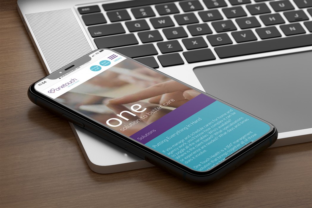
An integral part of the brand execution was the new website. We worked with the team at One Touch to establish a detailed site architecture and wireframe before any design work commenced. In this way we understood the functionality and content requirements early in the process.
Foremost in our minds when designing the site was to create a great user experience (UX). A significant amount of time and effort went into understanding the different visitor journeys and the outcomes we wanted them to have at each part of the site.
The new site captures the spirit of their new brand and delivers compelling narrative for their target audiences - see images below.
Integrated Marketing:
We worked with One Touch in developing an integrated Marketing Plan (IMP). This looks to set out a strategy and implementation plan for multi-channel marketing communications. For Online it includes target persona mapping, search engine marketing (SEM), content development - optimised for their audience, advertising and digital PR. Lead development and conversion are central to this digital strategy. For off-line communications we have developed specific plans for advertising, event marketing and PR activities to deliver on their growth ambitions.
Conclusion:
We are really proud of the work we have done with Brian Sheridan and the team at One Touch. We are confident we have developed a strategic positioning which will help to differentiate their offer uniquely and propel their business and brand towards the ambitious targets they have set for themselves as a business.